The FAQs are AI-generated, and Fortune India is not responsible for its content or any associated copyright issues.
Google rolls out Gemini redesign with unified tools layout
/ 2 min read
Google’s AI app gets a cleaner, visual-first interface with unified tools, faster access to creative features, and platform-tailored design touches.
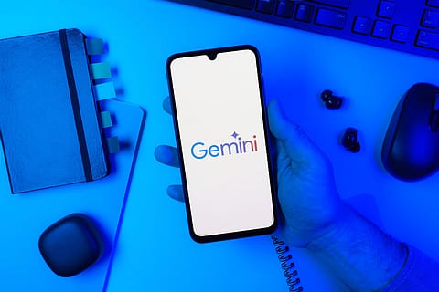
Credits: Shutterstock
Google is reworking the front end of its Gemini app, bringing about a shift towards a more visual, task-oriented interface.
What’s new in the Gemini app
As reported first by 9to5Google, the redesign consists of a simplified homepage built around a pill-shaped prompt bar, replacing the more cluttered input layout seen earlier. Voice input and Gemini Live sit alongside it, while a new “plus” button opens a bottom sheet for quick access to photos, camera, files and notebooks.
Tools like image generation, video, music, canvas, deep research, and guided learning are now grouped into a single, scrollable section with brief descriptors. These unified tools layer has already been tested across platforms and is now being extended to mobile as well.
Navigation has also been reworked. The model picker returns to the top-left as a dropdown, while the account switcher has shifted to the bottom. Icons have been thinned out and rounded, reinforcing a cleaner visual language.
A more visual interface
The redesign leans heavily into visual feedback. The homepage now features a pulsating gradient background, and interactions within chats extend that aesthetic rather than confining it to static screens. On iOS, the update integrates Apple’s Liquid Glass design elements more deeply, pointing to platform-specific tailoring rather than a uniform rollout.
Even chat mechanics are being adjusted. The “thinking steps” feature, which was previously more visible, now appears as a bottom sheet when accessed. This suggests Google is prioritising cleaner conversations over transparency by default.
Why this matters
The redesign focusses on simplifying navigation and grouping features that were previously scattered across the app. By placing tools such as image generation, research, and canvas in a single section, the update reduces the number of steps required to access different functions.
Recommended Stories
According to 9to5Google, the redesign is currently in limited rollout, primarily on iOS, with no confirmed timeline for wider availability.
How have users reacted
Users have hailed this update as a massive upgrade from the previous look. "I was just using the app, went out of it and opened it again. And it booted to THIS. This looks AMAZING!" noted a user on Reddit. As this update has been rolled out to select users for the iOS, Android users are waiting for the update to arrive. "Looks great, hope they bring this to Android one," another user noted. Users who didn't have initial access to the update showcased their frustration too. "I wish they would just release things. Instead they give something to like 1% of people. Then a month later maybe 10%. Eventually someday maybe they actually finish rolling something out. JUST ROLL IT OUT," a Redditor said.